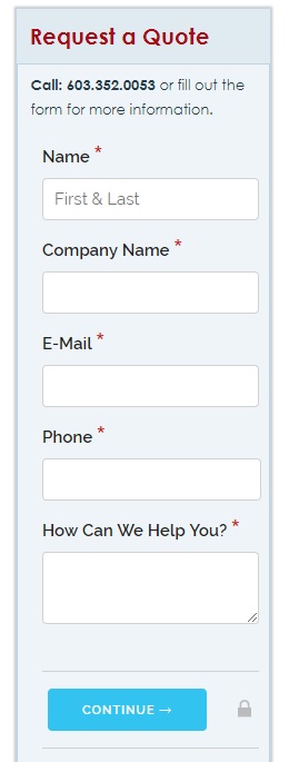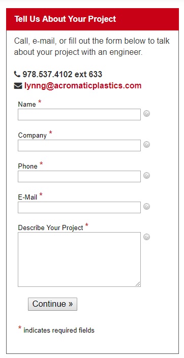
Now, not having a form on every page isn’t going to make or break your website’s success. Customers still reach out via email and some pick up the phone. However, we’ve found that our clients get a lot more inquiries by placing these quick, easy-to-fill-out forms right in front of web visitors.
These forms act not only as a contact portal, but also as a soft call-to-action, encouraging visitors to reach out. This way, users have a clear idea of what to do next if they’re interested in your product or service. The more obvious and simple to complete your “next step” is, the more likely you’ll get conversions.


Here’s a few more reasons why you should add quick contact forms to your site:
- They’re Quick and Easy
People like easy. Sometimes, picking up the phone or sending an email feels like too much work. When time is limited, having a quick, no commitment option is extremely appealing. You don’t want to miss out on potential buyers because the only way to contact you is via phone. Give users multiple options to contact you, and let them pick how they want to do it.
- Today’s Buyers are Digital Natives
Many of today’s buyers grew up in the digital world. They’re comfortable with the Internet and they like to do everything through it. There’s a reason texting is so popular – the younger generations don’t really like to talk on the phone. To keep up with the way the world is moving, companies need to appeal to this new buyer. The customers of yesterday are retiring. Digital is the future.
- They Work
Last, and most important, we’ve seen these forms work for our clients. Some of them get over 100 forms each month. Sure, they still have customers calling in and sending emails, but they probably wouldn’t be getting as many inquiries without the forms. It’s just like the above bullets say: people like options, they like easy, and a lot of them are used to digital. Quick contact forms appeal to these qualities, and that’s way they convert.
Ultimately, you want to give users as many opportunities to contact you as possible. And you want to prompt them to contact you. And you want to make it easy. Quick contact forms accomplish all this, and they’re fairly simple to add to your website.
There are also a lot of other benefits we didn’t mention here like how you can use a CRM system to send automated follow ups to customers once you have their email address. You can also set up tracking on these customers – from where they went on your website, to whether they opened your emails. Not to mention, forms save you time in sorting leads, and the information is backed up through your website. If you’re still not convinced, we recommend at least testing it out. You have nothing to lose, and a lot of RFQs to gain.
Stay tuned for part 2 of this blog, on the best way to format quick contact forms for conversions!
