
The answer is: Probably. Why? Because seventy percent of B2B websites don’t have a call-to-action (CTA), which is very, very wrong. In fact, every landing page should have a clear CTA, preferably one that is easily visible and interesting.
All search engine specialists know that getting clicks is only the battle. The war is what happens on the landing page. This is where the money you spent on SEO really counts because visitors make the decision to contact you, buy your product – or not. So, you want to make it easy and enticing for them to take the next step, no matter which landing page they click into. How? With the perfect call-to-action.
What’s a Call to Action (CTA)?
The call to action is simply the action that you want your visitors to take – whether that be signing up for an email list, inquiring about products, scheduling an appointment, downloading a brochure, etc. Typically, the CTA is displayed in the form of a digital “button” (see below) that visitors are prompted to click on your website. However, CTA buttons may also appear in emails, blog posts, social media, eBooks, and more.
Now that you know what a call to action is, why it’s important, and that you should have one on every page, it’s time to get down to the details. Below are three essential tips for crafting effective CTAs.
1. Make It Visible
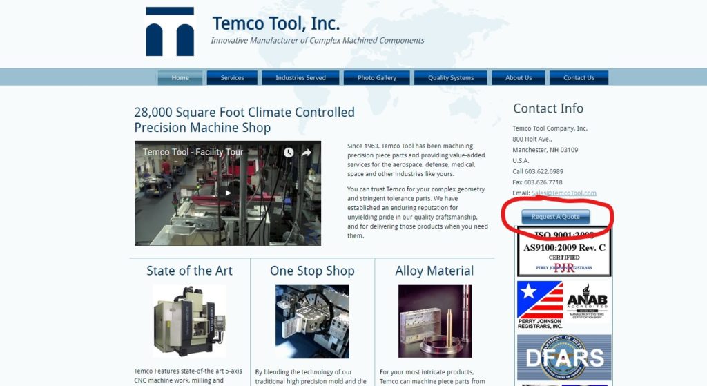
Research suggests you only have 8-seconds to capture the attention of the average visitor before he/she clicks away, which is why having a clearly visible CTA is essential for sales conversion. The call-to-action button should be one of the first items your viewers see, which may mean making it larger, putting it in a more focal position, or using eye-catching (but tasteful) graphics. Whichever design you choose, make sure viewers don’t miss it!
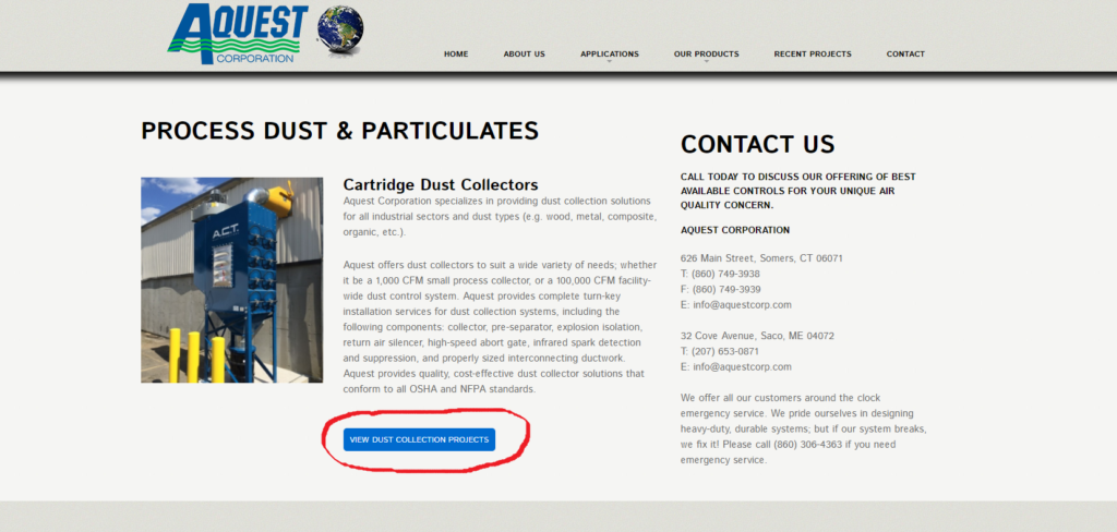
Remember though, less is more. You don’t want to steer visitors away with an overbearing button; it should be easily seen without taking away from the rest of the page. See below, one of our clients, Aquest, used a color that stands out to differentiate their CTA from the rest of the landing page. The button is visible and aesthetically pleasing, but it’s not so prominent that visitors won’t see the other content on the page.
2. Use Creative Language
Don’t make the mistake of thinking visitors don’t care about your call-to-action’s copy. Over 90% of visitors who read your headline, also read your CTA. If you were a marketing professional, you wouldn’t end a sales pitch with a generic, unoriginal statement. Similarly, it’s not enough to go with the standard ‘contact us’ or ‘submit’ for your CTA. Visitors are used to seeing these ordinary CTA’s on every website, which means that they can easily blend in to the background. You don’t want this.
You want to differentiate your business, and persuade visitors to act using strong, attention-grabbing verbiage. Choose something like: “Request a Free Quote” or “Reserve my Consultation Today.” Offering visitors an incentive also naturally increases the likelihood that they’ll click on your CTA. Try prompting users with a coupon or a downloadable guide related to your business. Words like Want, Guarantee, You, Save, Now, Try, and Free have also shown to be particularly successful at conversion. Ultimately though, a CTA’s results depend on your specific audience and what they respond to, which is why it’s so important to test.
3. Test and Then Test Again
You can follow all the call-to-action tips available, but the only way to truly know what’s working is to monitor visitors’ response. Run an A/B test comparing two call-to-action buttons, see which one does better, and then try another test. Maybe the first time you tested the CTA copy, and this time you’ll test the button color or size. The most successful businesses are constantly using analytics to get to know their visitors better, and, in turn, learn how they can most efficiently be converted into sales.
HubSpot saw a 13% increase in conversions after testing their CTAs. Clearly, they’re doing call-to-actions right. Now, you can too.